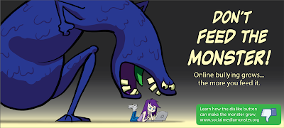
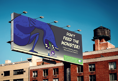
In this post I'd like to share an advertising campaign I've been working on for design class. Above you can see the campaign art and message, along with two mock billboard applications.
We were required to design a campaign around a (thankfully) hypothetical Facebook "dislike button". A fairly abstract brief, but I was determined to have some fun with it. I decided to focus on the button's potential use in online-bullying, also its potential effect on the mental health of children.
The concept was to have a memorable blue monster that would grow larger and larger as children were nasty to each other online. Anyone familiar with Studio Ghibli's films will surely notice the influence in the design of this monster - its body shape heavily inspired by the grotesque 'No Face' in Spirited Away.
Below are a couple of the visual development sketches.
I hope you enjoyed seeing some of my illustration and design process. If you'd like to see more of this type of thing, please do let me know in the comments below!


