Sunday, July 22, 2012
Mall sketches
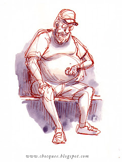
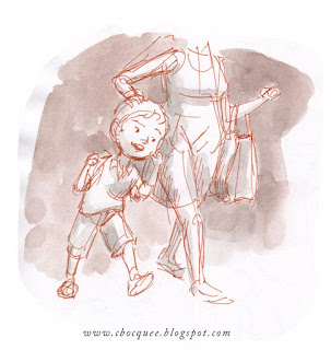
Given the briefness of these opportunities I usually observe for as long as I can first, trying to draw in my mind before putting pen to paper. Usually once people notice they have become a subject I am done with the observation part, so I don't think it's too uncomfortable for anyone involved. It's much easier to look without being noticed, than to look-and-draw without being noticed, and I think it's good practice for the visual memory to divide drawing and observing in this way. In fact drawing in-your-mind only is something you can do anytime you want to make visual notes. Just look as if you really were drawing, following the contours and the forms. People get less mad this way, and it's amazing how much looking you can get away with!
Saturday, July 14, 2012
Friday, July 13, 2012
Thursday, July 12, 2012
Wednesday, July 11, 2012
Tuesday, July 10, 2012
Monday, July 9, 2012
Sunday, July 8, 2012
Saturday, July 7, 2012
Friday, July 6, 2012
Life drawing - 1
I've just done a bunch of scanning of recent life drawing, so I'll be posting one a day for the next week or so. I hope you enjoy them.
Wednesday, July 4, 2012
Recent life drawing
I've been trying a little technique in order to simplify my pen work, which I picked up from a tip on Wilhelm M. Busch's process. That is, using a light blue pen to rough out the drawing first. Of course, you could just use a light box, but this technique is useful on the run. It's easy to eliminate the coloured under-sketch after the drawing is scanned, but I've left it in here so you can see.
Busch was an excellent draftsperson whom I only recently discovered thanks to some other bloggers. Observe the looseness of his lines, and yet the underlying design of composition, structure and gesture are all really solid.
Thursday, June 28, 2012
Thursday, June 7, 2012
The Ghosts of Nagasaki
Here's my final illustration for The Ghosts of Nagasaki. It depicts Inoue, one of the characters in the novel. Daniel has a real knack for interesting imagery.
Wednesday, June 6, 2012
Monday, June 4, 2012
Saturday, June 2, 2012
Friday, June 1, 2012
Book illustration
Friend and budding writer Daniel Clausen has asked me to provide a chapter illustration for his new book The Ghosts of Nagasaki. Here's some visual research and concept sketches for it.
Wednesday, May 23, 2012
Sketchbook
Just some snippets from my sketchbook. A mix of mall sketches and a caricature from memory. You could say 'compost' for future character designs.
Wednesday, May 9, 2012
Character design
Done some time ago, these character designs were 'spec' work for two different productions. The top one is an 'aussie santa' and the one below an immigrant janitor.
It's looking like both projects fell through, which means I can show them. Something to do with the GFC bogey man I suspect.. And perhaps setting Santa in the Australian summer time was too cruel a concept to contemplate anyway!
Saturday, May 5, 2012
Hand studies
Away, but not idle... not that there is anything wrong with
idleness. Please remember to stop and smell the roses fellow creatives!
My recent house move is over, but things are still not set up. Nevertheless I've been enjoying working only with the simplest of tools, namely a pen and sketchbook.
Getting stuck on drawing a hand pose recently I thought I'd delve a little deeper into the problem. Study and visual research can be tedious, and stifling to the creative urge I find. But since I was doing it, I thought I'd do it 'good'.
You may notice I went to the trouble of studying fingers in and of themselves. It became apparent that my inability to draw the given hand posture was actually a problem with drawing fingers. This would make sense given they are 50% of our hands!
Saturday, March 24, 2012
Animation project
Back in 2010 I was commissioned to design characters and produce a few minutes of animation for this community health education film directed by David Hansen. The film is a blend of live-action and animation. We discussed using 3d CG animation initially, but in the end decided on Flash style animation due to the tight deadline.
An excerpt of the full film can be viewed HERE.
Thank you to the people of these communities for allowing me to showcase my contribution on this project.
Saturday, March 17, 2012
Tuesday, March 6, 2012
Ponyo BG studies II
A couple more studies of background art from Ponyo. I'm finding that gouache and coloured pencil is a really great combination. As far as I can tell this is what was used in the actual backgrounds for the film, along with pastels. Apart from being nice and opaque when you want, gouache appears to be quite suitable for watercolour like effects. However getting the right mixture is something that will take just as much practice and experience to do well. As for the coloured pencils, good quality ones proved essential for vibrant marks. Scribling away with dirty hands I really did feel like a child again.
Monday, February 27, 2012
Ponyo background study
It was time to learn gouache I thought... So here's a study of a background from the beautiful studio Ghibli film 'Ponyo'. After struggling with watercolour the past 12 months or so, it's so nice to use a medium which is pretty forgiving.
Wednesday, February 15, 2012
Tuesday, February 7, 2012
Concept art - Frog Orchestra
I finally got around to scanning these... Here are some preliminary sketches for the 'Frog Orchestra' piece posted last entry. Included are two outdoor paintings of a gully which were part of the inspiration for the colours and lighting. Some of the thumbnail concepts have a better, bolder colour scheme I feel. And the final piece got a bit tight and fiddly. That's just experience I guess..
Subscribe to:
Comments (Atom)


