Pages

Sunday, May 12, 2019

Elephant Story illustration

The 'golden age' animated film Dumbo had been a favourite of mine and a source of inspiration since I first saw it. More than the story specifics, it was the WAY the story was told that really appealed to me. I still recall the emotions that the movie was able to stir in me.

For some time I've been toying with the idea of telling my own elephant story, but in picture book form. Anyone following my art will know I like to draw elephants, so this is not my first idea to feature elephants. I've gone on to write a short story about a family of elephants. It's only a first draft, and needs a ton of polishing.

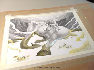
This is where the illustrations below fit in. In the first one the young elephant is separated from his family by lava. In the second he discovers his father in a grim state. Character designs are not completely resolved yet, so there's still some consistency issues. Think of these as 'concept' illustrations.

It was natural to study the beautiful storyboards Bill Peet made for the animated classic Dumbo. I wanted to try and come close to that film's masterful handling of emotions, and combine this with some of the epic landscape imagery I was seeing in my imagination. It was a very tall order, but this side project was only ever meant to be something to hone my illustration / storytelling craft. As is often the case, my ideas for personal project tend to be overly ambitious. So whether I actually make the thing is yet to be decided.

As it turns out Dumbo the animated film is being remade, so I've perhaps unwittingly tapped into the zeitgeist. I suppose it was only a matter of time before that masterpiece of animation was remade!

The first illustration to characterise the elephants


A value study and the finished illustration

The thing I love about the Dumbo storyboards is the way tonal values are used to help tell the story. I think my digital mockup worked out better in terms of value. I was however happy with the texture and subtle value changes in the final illustration.


The rendering was built up in many passes


Finally I combined a single black watercolour pigment

I hope you enjoyed this update. Feel free to leave any thoughts, comments, or questions below. 

As always your support is greatly appreciated. If you like you can find me on the usual socials below,

I also have a new art print shop,
Friday, March 30, 2018

Online bullying monster

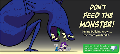
Digital illustration of a large blue monster about to eat an online bully.
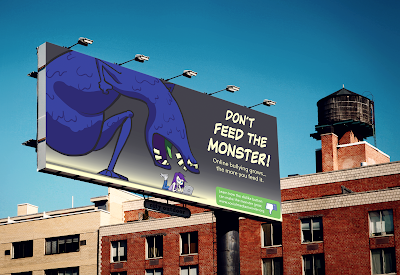
Cartoon style illustration of a monster for a billboard advertising campaign
Cartoon style illustration of a monster for a bus stop advertising campaign.

In this post I'd like to share an advertising campaign I've been working on for design class. Above you can see the campaign art and message, along with two mock billboard applications.

We were required to design a campaign around a (thankfully) hypothetical Facebook "dislike button". A fairly abstract brief, but I was determined to have some fun with it. I decided to focus on the button's potential use in online-bullying, also its potential effect on the mental health of children.

The concept was to have a memorable blue monster that would grow larger and larger as children were nasty to each other online. Anyone familiar with Studio Ghibli's films will surely notice the influence in the design of this monster - its body shape heavily inspired by the grotesque 'No Face' in Spirited Away.

Below are a couple of the visual development sketches.

thumbnail sketch for a billboard ad
pencil drawing of a kid for an online bully illustration

I hope you enjoyed seeing some of my illustration and design process. If you'd like to see more of this type of thing, please do let me know in the comments below!

Thursday, March 15, 2018

Where do stories begin?


Can a good story idea come from a single image?

That's the question I've been asking myself. In this post I'll take you through a new personal project idea that began just like this. 

It has been a while since my last post so if you've come back, thank you! And if you're a new visitor, a big welcome! Let’s keep going…

I read that the story of Narnia came to CS Lewis in the single image of a faun carrying an umbrella and parcels through a snowy wood. It's interesting to note that some writers think in visual terms - I've known a few who do. The beauty of being an illustrator is the ability to test these ideas in visual form, which is especially handy in the case of visual narratives. This brings me to the images I want to share with you today.

drawing of elephants travelling in a line

The idea began with an image of elephants traveling in a long line.

illustration of a baby elephant with family climbing a mountain

Not the most original concept. Not much of a concept at all really, and yet something about the visual grabbed me. I began to see what kind of ideas developed as I added a baby elephant as a possible protagonist. A little warmth entered the visuals, and pathos became a real possibility.

early thumbnail drawing

I continued to develop the world that they might inhabit, and it started to look a little more hostile. Now there was some tension, a hinting at some sort of drama.

small planning drawing of elephants walking over lava

small planning drawings of elephants walking over lava

small planning drawing of a volcanic landscape

small planning drawings of a volcanic landscape

finished pencil illustration of a volcanic landscape

There are numerous themes that I feel these visuals could potentially evoke. At this early stage however, a clear narrative eludes me. I will continue to develop these visuals between other projects and see where it leads. I feel at the very least that a visually interesting series of illustrations could unfold.

In the mean time I’d love to hear your thoughts in the comments below, or if you prefer feel free to get in touch with me.

Tuesday, September 13, 2016

Willie's rescue

Digital illustration of a prisoner with shackles in a cave being rescued by mice.

"Willie was the only cheese maker in the land. In the shadows, a slow but unwavering rescue mission was underway."

Monday, November 2, 2015

Mini outdoor pastels

en plein air pastel drawing by illustrator Christian Bocquee of a fishing boat in a mangrove creek

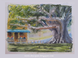
en plein air pastel drawing by Australian illustrator Christian Bocquee of a beautiful old fig tree

en plein air pastel drawing by Australian illustrator Christian Bocquee beside the water at Cabbage Tree Creek


I've been making a regular exercise of getting out and doing quick small pastel studies. Hopefully I can keep this going. The biggest challenge is often finding a spot to paint. There's a lot to think about - how's the light, the shadows, am I being too conspicuous, is there a shady spot to sit, etc. But it's also kind of fun driving around looking for inspiration. If you enjoyed looking at these, I'll be posting more regularly over at my facebook page, here.


Monday, September 21, 2015

Walter Chipwitther re-design

Pencil sketch of fictional character Walter Chipwitther, by illustrator Christian Bocquee.

This was my re-design for the final week of my class back in March(-ish). I haven't yet had a chance to incorporate Stephen's feedback or add colour. Hope you like him. 

Thursday, April 9, 2015

Hyde character final

final character design of Mr Hyde

My final Hyde design. The next step is colouring, then expressions & attitudes.

Thursday, April 2, 2015

Mr. Willy Wonka

Trying to put my new understanding of character design to work on some more characters. This is one of my favourite characters from one of my favourite films (I haven't read the book). I love both the original and the more recent Burton version, but being an 80's kid, Gene Wilder will always be the real Willy Wonka to me. For this design I wanted to forget both of these films. 

Cartoon style character design sketch of Willy Wonka in pencil.

I based it loosely on Frank Lloyd Wright.


One of the things I loved most about Wonka in the original film and wanted to capture was his ambivalence. I remember as a kid not quite knowing whether he could be trusted or not. I hope that my design has some of that quality in it.

Monday, March 30, 2015

Jekyll & Hyde - WIP

Hyde character design process sketches
 Hyde character design process sketches
Jekyll character design process sketches

Here are more design process sketches for Jekyll & Hyde. Doing all this research is a worthwhile discipline which I'm not used to doing as thoroughly as this.


Monday, March 16, 2015

Jekyll & Hyde gestures

 
I still have quite a bit of work to do in clarifying the designs, but I thought it might help to flesh out their personalities if I did these quick story/gesture sketches first.

My idea for a fresh take on Jekyll & Hyde was to make Jekyll a Traditional Chinese Medicine doctor who's obsessed with potency herbs. Hyde would be his wild party-animal state after taking the concoction of herbs.

4 weeks in, and the course has been a lot of fun, a lot of drawing, and a lot of eye-opening. My biggest challenge has been simplifying the design and making it read clearly. The biggest eye-opener has been thinking more of shape than anatomy.